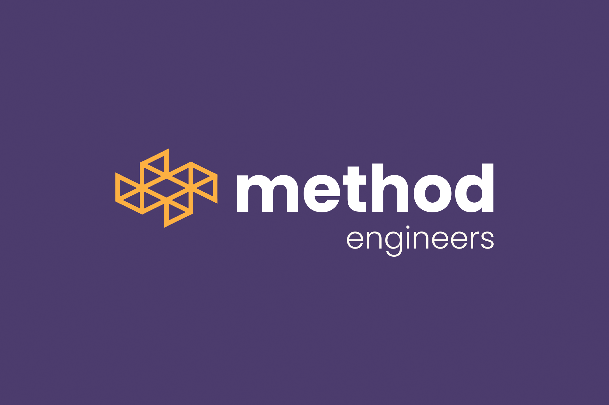
The objective of this project was to create a logo and visual identity for a structural engineering firm which prides itself on it's innovative and solidly grounded work.
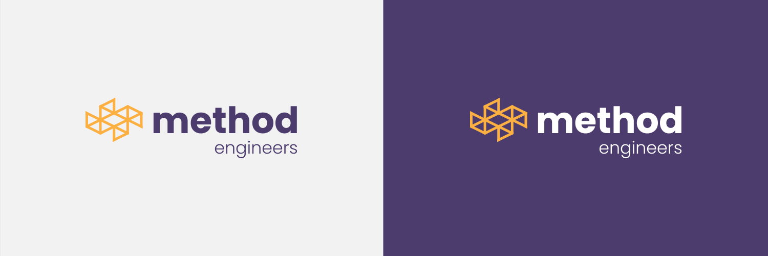
The logo design draws from the concept that triangles are some of the most rigid and stable shapes used in construction today and are increasingly trending in modern examples of award-winning architecture. I created a grid of triangles to symbolize architectural stability. The resulting symbol is strong, balanced and stylish. It alludes both to the solid foundation from which the firm's work is built upon as well as it's innovative nature through the use of precision craftsmanship, executional symmetry and elegant design.
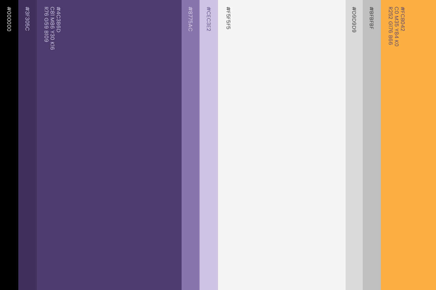
The brand name Method, like the logo's symbol, is a tribute to the firm’s meticulous and innovative design process. The brand's main colors were chosen for their associated meanings. Yellow, for its association with light and security. Purple, for its association with creativity and innovation.
Brand naming
Logo and visual identity
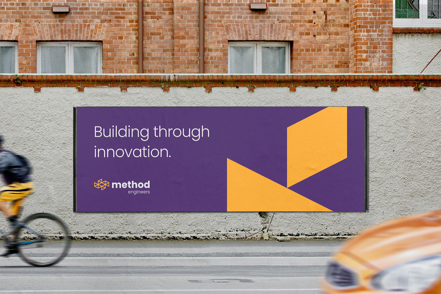
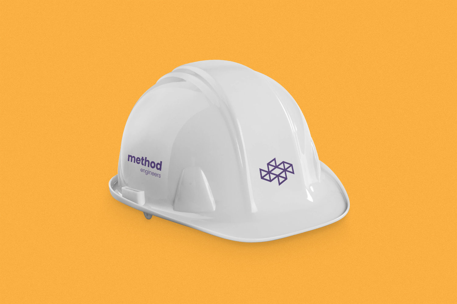
Collateral design
